In Conversation with matt lambert........
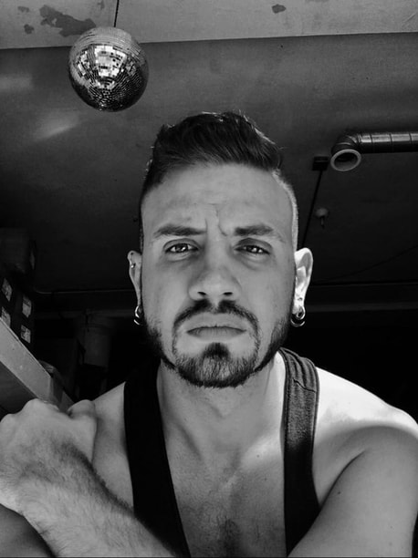
matt lambert is a non-binary, trans multidisciplinary collaborator and coconspirator working towards equity, inclusion, and reparation. They are a founder and facilitator of The Fulcrum Project and currently are a PhD student between Konstfack and University of Gothenburg in Sweden. Their research engages with the relationship of craft to nation structure, gender, indigeneity and nomadism. They hold a MA in Critical Craft Studies from Warren Wilson College and an MFA in Metalsmithing from Cranbrook Academy of Art. They have exhibited work nationally and internationally and have actively contributed writing to Art Jewelry Forum, Garland, Klimt02, Metalsmith Magazine, Norwegian Craft and the Athens Jewelry Week catalogues.
Settings & Findings with matt lambert
As some jewelers or anyone who has ordered from a jewelry supply store the “settings and findings” tabs are familiar. To others it conjures a table setting which can mean adding a seat at the table. A table that makers are able to expand, take apart, refurbish, repurpose or make a completely different table. It is also a reference to the setting of a stone in a ring, to hold something precious or to question what is worth holding onto. It is the scenography, the space around where something occurs. Findings in a jeweler’s sense is a collection of elements used to hold together or combine elements. Clasps, pins, rings. Findings also can be taken as a term for discovery. The energy of finding something new or finding something once thought lost.
I am a sucker for the metaphors of craft.
I have generously been offered this space to function as a visual journal. Carte Blanche was the term used. As I move through a PhD in Craft between Konstfack and HDK Valand in Sweden. This space will become a visual for showing what I am looking at, where I have been, where I am going, but more importantly opens a place to offer others to develop concepts, to share thoughts, movements and directions. It’s a test site for not just myself but to share with others to explore and expand horizons of who we look at, how we look at and what and who we look with. This space becomes a travel log of flaneur-ship, rag picking and wandering to create space for constellations.
For thinking about our settings and findings.
matt lambert
Settings & Findings Episode n. 1 with artist SaraBeth Post
I am excited to start this series with SaraBeth Post. I connected with SaraBeth through social media when a friend posted a ring that she had purchased from them. Through a series of clicks and follows we have built a correspondence between us. I asked SaraBeth to highlight the work she has been doing to raise social consciousness and economy towards the support of Black individuals and organizations in the U.S. You will notice in this series that I sometimes have asked makers and collaborators and groups to address a specific project. The intent is to provide specific focus but also to encourage you to follow,
look and support by following the links provided.
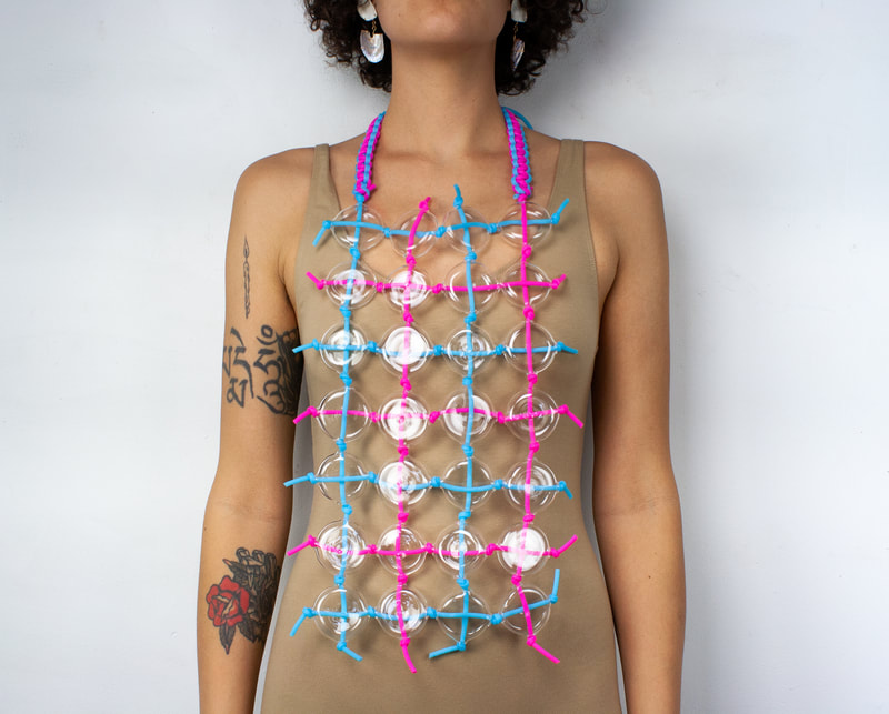
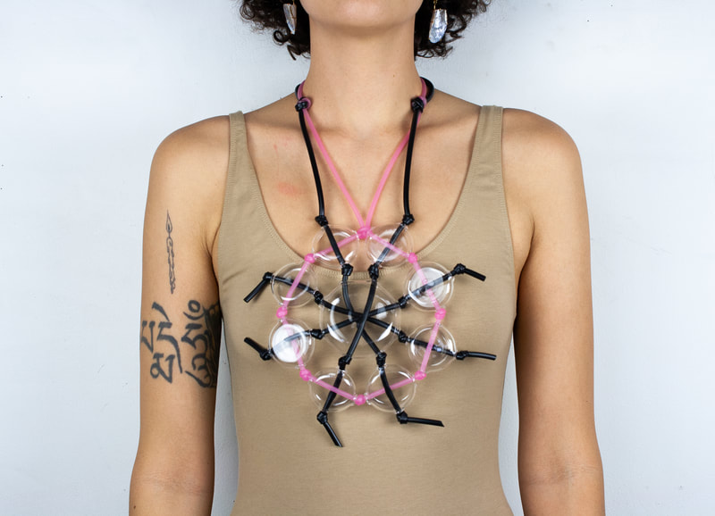
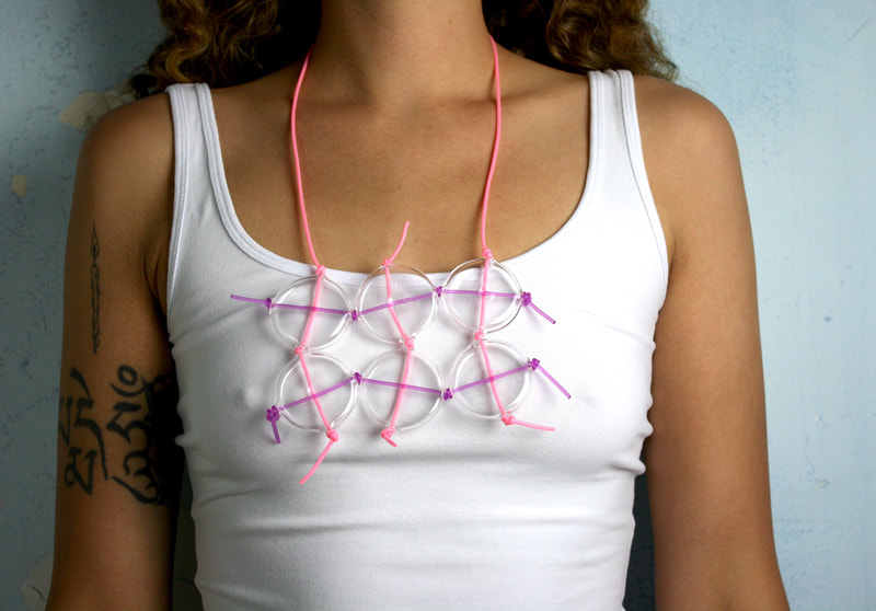
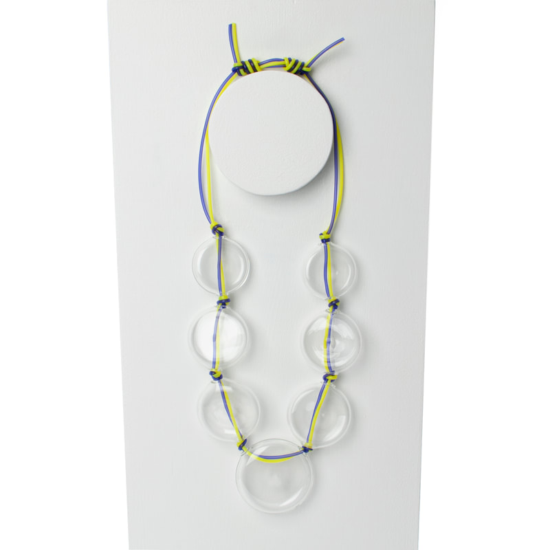
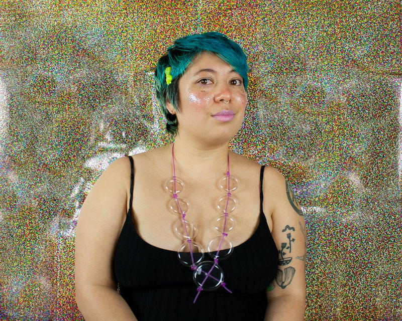
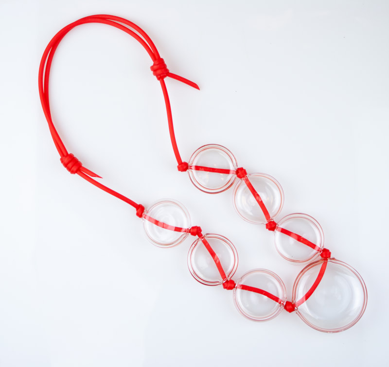
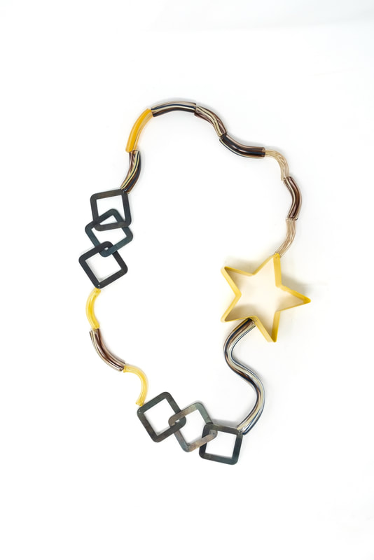
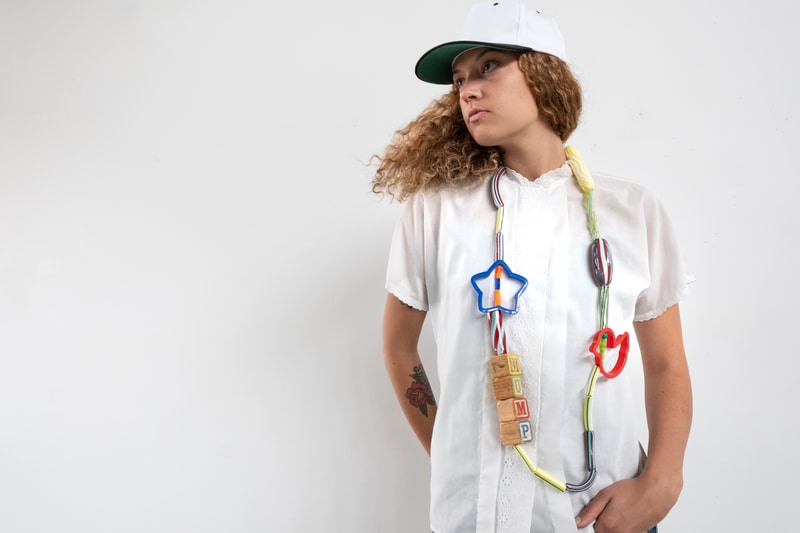
For me SaraBeths work discussed here is a physical reminder of the people she is supporting. As necklaces they are a presence around the neck that is felt when first put on yet they are extremely lite allowing us to possibly forget they are there even though we have them around our necks. Glass as a material in this situation is stable and very wearable however it also highlights the need to remain conscious as we navigate our days to prevent harshly running into something to cause it to break. For me this is a beautiful metaphor of supporting each other, the ability for autonomy and the need to be aware of our bodies
as we exist in relationship to someone else.
How do we use jewelry to remind us of larger ideas?
How do we exist and also prevent the shattering of another?
How do we move and allow space for the movement of a body that is not our own?
-ml
SaraBeth Post’s Settings and Findings:
The impact of 2020’s attention on the not-new horrific treatment to Black bodies, Black persons, Black spirit, and absolute injustice propelled me to use glass jewelry as a means to raise money and awareness for David McAtee, Jacob Blake, Quawan Charles, and organizations supporting Black LGBTQ. These men and too too many more have died by the hands of brutal police enforcement. The first call to my followers on instagram was an exchange, their monetary donation for a handblown glass necklace secured by knots on a rubber cord.
As a response to the visible fundraising I have facilitated during the pandemic, in necessity to raise awareness of the lack of Black acceptance in America, the beautiful matt lambert has invited me to set a mood ushering others to their seat at the table through my wearable work.
My finding lies here; a cord of empathy, a notion to help, the will to harness transparency.
As an artist who works with craft and a healer who works with energy, I seek to combine my abilities to create objects that give power to the person it adorns in a spiritual way. The setting is shared space between the physical and etheric/subtle body. Glass is an insulator. I view these worn elements as protective in two ways, first insulating the energy of the wearer and second a force field that disables penetrative external forces of energy. The necklaces exist in the world as a physical interpretation of our etheric bond to the universal life force. Each person that has one of my handblown glass necklaces, acquired through a monetary donation for the family of the Black lives that were unjustly murdered, has in their power a wearable symbol signifying themselves as an active spirit in the scientific and spiritual vibration of universal consciousness.
-SaraBeth Post
Website - sarabethpost.net
Instagram - @ultralit.sb
Venmo - @sarabethpost
SETTINGS & FINDINGS EPISODE N. 2 ECHOES OF A MEAL
Intro:
Mette Saabye, Helen Clara Hemsley, Josefine Rønsholt Smith and Janne Krogh Hansen are literally setting the table in their project Echos of a Meal. Originally intended to be shown during Schmuck 2021 as part of the regularly appearing Polyphonous Events, the collaboration was presented digitally which perhaps allowed more of us a seat at the table to “leave with both (our) minds and bellies full.” Bon Appetit!
https://katharsisdrill.art/BW/Echoes_of_a_meal.mp4
Settings & Findings:
Echoes of a Meal: A conversation about contemporary jewellery in the setting of a traditional Danish meal.
The concept of a meal and how it has the ability to echo life around us forms the common foundation for the group’s reflections, and especially focuses on how a meal can bring people together and bolster their sense of community, through close interaction and the exchanging of views and observations.
Echoes of a Meal refers to a traditional Danish table setting with its classic Danish dishes, specific aesthetic and the intensity associated with the togetherness a meal can offer. For us as jewellery makers, the creation of jewellery and the preparation of a meal both share an intense use of the senses, as both a meal and jewellery is produced, and used by the body.
The remains of a meal furthermore serve as a memory of the event and are decoded by the senses and create a connection between both time and place. The individual works approach the theme with their own particular use of materials, narrative and form, but ultimately come together to present an extensive menu of considerations and expressions.
ml
----------
Digital Presence:
Mette Saabye: Instagram @objectsofdesire - www.mettesaabye.com
Helen Clara Hemsley: www.helenclarahemsley.dk
Insta: @helenclarahemsley_jewellery
Josefine Rønsholt Smith: https://jrsmithjewellery.com/
Insta: @knaekkethvid
Janne Krogh Hansen: https://www.jannekhansen.com/
Insta: @janne_k_hansen
Sliding Gallery artists photo captions from 1 to 12
Sliding Gallery Artists Photo Captions
1. Echoesofameal
Helen Clara Hemsley
Edgy
James Bates Photography
2. Echoesofameal
Helen Clara Hemsley
I’m great
James Bates Photography
3. Echoesofameal
Helen Clara Hemsley
The hardest part 1 and 2
James Bates Photograph
4. Echoes of a Meal - Group photo:
Photographer Dorte Krogh
5. “A scent of raspberries” Mette Saabye
Brooch - 18k & embroidery yarn.
Screen shot from film.
6. “The essence of lemon” Mette Saabye
Brooch - 14k, embroidery yarn & opal beads
Screen shot from film.
7.Janne K Hansen
Echoes of a Meal
2020
Title: Alt hvad du lod tilbage/This is all you left (Shrimp/button/sauce)
Brooch
Materials: Mother of pearl button/paint/14 kt Fairtrade gold
Photo: Karl Ejnar Nybo
8. Janne K Hansen
Echoes of a Meal
2020
Title: Burnt
Pendant (Napkin/gold ring/chain)
Materials: 14 kt Fairtrade gold/silk/Japanese glass beads
Photo: Karl Ejnar Nybo
9. Janne K Hansen
Echoes of a Meal
2020
Title: Fuck/Spist af
Pendant/fork
Materials: Sterling silver
Photo: Karl Ejnar Nybo
10. Josefine Rønsholt Smith
Ring
Screen shot from film.
11. Josefine Rønsholt Smith
Necklace
Screen shot from film.
12. Josefine Rønsholt Smith
Necklace
Screen shot from film.
SETTINGS & FINDINGS EPISODE N. 3 KRISTINA NEUMAN
Kristina Neumann
Intro:
I had the pleasure to first meet Kristina Neumann during Radiant Pavilion in Melbourne Australia with our interactions continued at Australian National University where I was a visiting researcher. Sadly this program was recently disestablished as part of the many jewelry/metal/body object programs globally that are currently fighting for existence. Jewelry as an object is always in discourse with a body and Neumann uses it here to question a bodies: home, positionality, and sustainability. As studios disestablish, close, fracture or merge how will we build community and home for our work?
Settings and Findings:
This body of work revolves around the idea of ‘home’. In particular, I speak from the setting and context of a developed country situated in the pacific, that has a violent colonial history. This country occupies the stolen lands of the longest surviving culture in the world. The lands from which I speak are those of the Ngunnawal and Ngrambri peoples.
The investigation I bring to the table, the previous question I examine in this setting, considers the cost of living, which has risen astronomically in recent times. The prospect of owning a house is consequently more pipe dream than reality, as the price of housing is continually being pushed to new highs.
This series of work is a personal exploration of the meaning of home through the use of architectural motifs, material and surface investigations and wearability. Locally made brick that is no longer in production, a finite resource, carries the weight of preciousness. Dryer lint, a by-product of the lived experience of a home, brings a sense of familiarity and comfort. The two materials together frame the internal/external dimensions of the pieces. Recognisable features like the window sill and a protruding drain pipe place the structure from the urban landscape.
This precious setting yields the following finding: a token, a small thing that one can take with them, a synecdoche of the home, worn against the heart and close to the body. This synecdoche is an important reminder of the constantly unstable and changing conception of what constitutes a “home”, especially at this time when house-ownership seems so unattainable for so many.
Online Presence:
Instagram: @Kristina_Neumann_
Website: www.kristinaneumann.com.au
settings & findings n.4 with viviana langhoff - adornment & theory
Viviana LanghoffIntro:
Owner of Adornment and Theory, Viviana Langhoff not only keeps the wheels spinning for other artists but somehow balances this with making regular collections and custom one of a kind creations. Her care and concern doesn't stop at the door of her business as she applies a model of generosity and creativity to all aspects of life. Making it necessary to have a split feature of Adornment and Theory and Vivianas own making work in an attempt to add some more facets to this setting. Setting and Finding: Viviana Langhoff’s work is centered around the idea of heirloom. Creating one-of-kind settings that can be cherished for generations, from materials both old and new. History, family, and storytelling are all often focused around objects; Viviana wants to design, craft, and make that heritage beautiful. Finding inspiration in history, travel, and functionality, her pieces integrate unexpected hues and intricate metalwork, making modern the shapes, stories, and glamour of past generations. Borrowing from the world of fine art, cultural adornment, and design, her custom work appeals to the expressive and open-minded individual — those who value individuality, creative collaboration, and are unafraid to stand out. Instagram: @vivianalanghoff_design Website: www.vivianalanghoff.com Venmo: @Viviana-Langhoff image captions
Viviana Langhoff - VL Collection Captions for images: VL1 “The Maria Ring - This 14K gold ring is named for Dior's first female creative director, Maria Grazia Chiuri, features a stunning large baguette citrine center stone surrounded by a diamond halo.” VL2 “The Marchesa Ring - Made of 14K rose gold with a pear shaped aquamarine center stone and diamond halo. This piece is named after Luisa Marchesa Casati, an Italian heiress, muse, and patroness of the arts in early 20th-century Europe.” VL3 “Behind the scenes - Every ring in the VL Collection features a responsibly sourced + fair trade gem hand selected by Viviana. Photo by Melody Joy Co.” VL4 “The Viviana Ring - Named after Viviana Langhoff herself, and inspired by the metal work of the Belle Epoch, this intricately detailed ring features a gorgeous one-of-a-kind Salt + Pepper diamond center stone set in 14k yellow gold with sparkling diamond accents.” VL5 ”The Viviana Ring + The Marchesa Ring” VL6 “The Beyonce Ring - The name says it all! This gasp-worthy 14k white gold ring features an incredible grey spinel center stone accentuated by a double halo of diamonds.” VL7 “The Signature Solitaire - Showcasing Viviana's signature style, this elevated Moroccan-inspired 14k yellow gold band features a fair trade grey spinel center stone and melee set diamonds.” VL8 “Sparkling diamond bands to elevate any ring stack.” |
Adornment & TheoryAdornment and Theory
Intro: "Its near impossible to put Adornment and Theory into a single category. This is why it is easy for this space to keep me charmed. A hybrid space that takes all the labels stuck on jewelry rips them off and puts things next to each other that are little often seen in such a setting. Fine gold and gems next to wood and plastic with none of the pretensions and all the hospitality. Adornment and Theory proposes a model with a sharp focus on representation and equity with little fear of discussing financial stability for the makers and employees that are within. It is easy to see when you are there why some people come in just for the hugs and laughter." ml Setting and Finding: Setting Setting a table I set my tables with care and love. Placing each element in such a way that whomever I invite feels welcomed, seen, and valued. With care and curation, I set tone. A tone of dignity. A tone of strength. A tone that cast a new vision My table is set with my personal best. My best is not reserved for special occasions, being alive is occasion enough. I bring myself fully to those I invite in. I am present. I am attentive. The table of our studio is abundant and prepared for fruitful discussions on equity, humanity, aesthetics, and the human propensity towards adornment. I create new seats at our table. Diversity is a given, equity is the goal. Belonging is the end point. Adornment and Theory is setting a scene NOT for a far-off future but for a better world/business/ and practice that we want to see in our present reality. Finding An evolution of an ancient art form. Connection points on the precipice of change.Embracing the disruption, I am finding my voice, and the voice of others historically silenced. Traveling finding new artists. Being invited into lives and homes. Intimate tables set I am finding humanity, creative gifts of manifestation, and the resilience of the human spirit. I am finding opportunities to grow, be better than I was yesterday discover new work that delights and inspires…and to bring all of these finding to my vocation. “Adornment and Theory is an independent jewelry store that specializes in artist and designer jewelry. Our studio showcases unique, one-of-a-kind jewelry that pushes accessory design into wearable art. We are passionate about representing emerging artists and brands who are crafting the future of functional art and design by offering wearable art from artists around the world, and custom jewelry from shop owner Viviana Langhoff. We are proud to represent over 40 women-identifying artists in our jewel box, amplifying women of color. Cultivating an environment that is welcoming to all, that’s simultaneously unique, beautiful, and accessible. Instagram: @adornmentandtheory Website: www.adornmentandtheory.com Venmo: @Viviana-Langhoff image captions
Adornment and Theory Captions for images: AT1 “22k Gold Plated Beetle Wing Earrings handmade by Chicago designer Alicia Goodwin. Made of actual beetle wings, these beauties are truly a dramatic and breathtaking piece to own and wear.” AT2 “The Crystal Waters Tourmaline Band by local Chicago designer Jenni Dowie. Featuring a mesmerizing bi-color tourmaline center stone with diamond accents, this ring was inspired by Jenni’s homeland of Scotland and the crystal waters that surround the mountains.” AT3 “A one-of-a-kind design by Adornment + Theory shop owner and designer, Viviana Langhoff. Named the Tapered Baguette Sunrise Necklace, this delicate vintage inspired necklace features beautifully detailed metalwork and a sparkling baguette diamond.” AT4 “One-of-a-kind, perfectly imperfectly matched tourmaline earrings, by designer Jeanette Park. These natural beauties feature large oval pink and brown tourmaline stones with black diamond and rhodolite garnet accents. Turning away from trend-driven looks, Jeanette makes distinctive jewelry with gems in bright pops of color, set in metal with just the right amount of edge.” AT5 “The open weave pendant by Laura Wood. Laura designs sculptural, contemporary jewelry that is incredibly lightweight and the definition of wearable art. Photo by Melody Joy Co.” AT6 “The Viviana Ring by A+T owner and designer Viviana Langhoff, paired with two diamond stacking bands by Chicago designer Jenni Dowie.” AT7 “Who says you have to choose just one?! We love to mix, match, and stack all our favorite rings for a unique one-of-a-kind look. This stack features rings by Viviana Langhoff, Jenni Dowie, and Misa Hamamoto. Photo by Melody Joy Co.” AT8 “Contemporary statement, balanced with timeless style. Geometric circle necklaces by designer Vanessa Gade.” AT9 “Views from our Logan Square Chicago jewel box. Photo by Melody Joy Co.” AT10 “It’s all in the details. Hand painted art deco arc by shop owner Viviana langhoff. Photo by Melody Joy Co.” AT11 “We love the light in our Logan Square jewel box. Photo by Melody Joy Co.” AT12 “Custom consults + stone viewings at the jewel box. Photo by Melody Joy Co.” |
SETTINGS & FINDINGS N.5 WITH Vivi Touloumidi
Intro by matt lambert:
I have known Vivi Touloumidi for some years now through the social gatherings of exhibitions and seminars. Her work as I have known it has always asked deep thoughtful questions and often promotes the viewer to consider the political actions of wearing. I invited Vivi to share with us some of their current research they are conducting as a PhD student at Antwerp Research Institute for the Arts (ARIA) that investigates what is jewelery and what does it mean to participate through a specific logic of research material. As Vivi state there is still so much more to learn that the findings here are only partially known creating a space for some exciting research growth.
The work started by thinking adornment in reverse.
What if, it was forced?
What then?
What if, it was created with the goal to devalue the body, not to enhance it?
And what if, it aimed at degrading the identity for the likes of the spectator?
My locality in Berlin gave me lots of food for contemplation, a few years back. About two blocks away from the new apartment, a well persevered WWII forced labor camp was located. I saw there some wearable badges used to systematize the bodies of the workers for the first time. The ontological question kept pending: Is this jewellery?
By several field visits and archival research, mostly in Germany, this body of work under the title “vom Abzeichen zum Auszeichnen“, emerged. It references back to the black triangle ; a sign which was assigned to any prisoner classified as “asocial” at concertation camps. Historically, it is the pink triangle, that is a well-known protest emblem, used by LGBTQ movements. That too, was invented by the Nazis as a derogating sign against homosexuals. A lesser-known aspect though, is that the pink triangle was intended for men only. The homosexual female bodies were classified as “asocial” (mostly, but not always). A grouping which targeted numerous sub-identities that spanned from homeless to non-conformist women to any behaviour that transgressed the top-down guidelines. The black triangle is considered historically the most feminized category of the WWII.
Following common strategies of socio-political dissent, such as appropriation and subversion, and while acknowledging similar locations of thought emerging globally today, the work proposes statement-pieces that speak of resilience, emancipation and self-determination of the female body.
my finding: there is yet much more to explore about the human condition and adornment.
www.vivitouloumidi.com
[email protected]
@vivitouloumidi
Artist Vivi Touloumidi
Vivi Toloumidi's work & Short Bio
Vivi Touloumidi
1977_Athens, Greece
Currently, living and working between Berlin, Brussels and Antwerp.
Vivi Touloumidi is an artist, researcher and a craftswoman. While, she serves as a lecturer at the Royal Academy of Fine Arts Antwerp (2018-onwards), she is conducting a PhD in the Arts at ARIA and University Antwerp, under the title “Pharmakos”. The enquiry investigates jewellery and body adornments at times of social conflict, where the symbolic and physical agenda of the wearable craft object is examined both historically and in contemporary times.
The project started by thinking jewellery in reverse. Instead of a wallpaper laid on the surface of the public body that displays value, the target was to investigate it as a tool that aimed to devalue, stigmatize and marginalize the individual identity for the eyes of the spectator by objectifying the body. This approach alines with Vivi’s overall artistic trajectory that aims at exploring adornment as a multifaceted cultural phenomenon and its manifestations of the human condition ; and thus therefore also as a medium of social restriction and control rather than only as item that enhances the body. Her practice investigates the wearable and the body-related object as an active agent to carry sociopolitical messages, evoke discourse and position a body in the public realm, while taking in consideration today’s social challenges.
Her recent work “vom Abzeichen zum Auszeichnen” emerged from research at historical archives, where cases of social injustice and oppression had been documented. The investigation looked into the design evolution of wearable signs, worn as indicators to systematize human bodies during the WWII. The work draws its title from administration letters of the time and it appropriates and subverts the black triangle ; a sign which was assigned to any prisoner classified as “asocial”. Thus, the work attempts to reverse it into an honouring distinction. Historically, the pink triangle is a well-known protest emblem used by LGBTQ movements. That too, was invented by the Nazis as a derogating sign against homosexuals. A lesser-known aspect though, is that the pink triangle was intended for men only. The homosexual female bodies were classified as “asocial” (mostly, but not always). A grouping which targeted numerous sub-identities that spanned from homeless to non-conformist women to any behaviour that transgressed the top-down guidelines. The black triangle is considered historically the most feminized category of the WWII.
Following common strategies of socio-political dissent, such as appropriation and subversion, and while acknowledging similar locations of thought emerging globally today, the work proposes statement-pieces that speak of resilience, emancipation and self-determination of the female body. On this ground, the choice of the overall title “Pharmakos” comes full circle ; the word derives from the Greek language to describe an entity that performs simultaneously as the poison and the remedy.
(images : https://vivitouloumidi.com/vom-Abzeichen-zum-Auszeichnen-1)
Apart from the material-based work, the gathered documents will be brought into light in an upcoming publication within 2021.
Specifically, the book will include administrations letters of the regime that discuss extensively the evolution of the “OST” badge, which was used at forced labor camps and only on workers who originated from the eastern occupation territories. A long trajectory of correspondences, which elaborate on its redesign and need thereof.
_________
Vivi Touloumidi’s work has been published and shown internationally in several curated gallery and museum exhibitions, such as the Pinakothek der Moderne (DE), COLLECT (UK), KunstRAI (NL), ITAMI Museum (JP), Hellenic Museum (AUS), CODA Museum (NL), GRASSIMESSE (DE), World Crafts Council (BE), SOFA (USA) and is part of the public collections of the Schmuckmuseum Pforzheim (DE), Cominelli Foundation (IT) and the Marzee Collection (NL), among others. She was nominated for SCHMUCK_Herbert Hofmann Prize, Talente and Friedrich Becker Prize in Germany (twice). After studies in Athens, Greece, she continued her education in Germany, Canada and at Konstfack University in Stockholm, Sweden, from where she holds an MFA in the Crafts. Since 2018, she is a lecturer at the Royal Academy of Fine Arts Antwerp, is conducting a PhD in the Arts at ARIA and University Antwerp, became a member of CCQO (Culture Commons Quest Office), while she also acts as a co-curator of the annual artistic research METHOD/ART seminar.
For more info/Cv , please visit: www.vivitouloumidi.com
SETTINGS & FINDINGS N.6 WITH Juvana soliven
SETTINGS & FINDINGS WITH ARTIST JUVANA SOLIVEN
Intro by ml:
"A big reason Settings & Findings was started was to see the many ways people in jewelry
would respond to being asked what their setting and findings were. Creating a space for complex unpacking,
academic language, narrative and of course poetry. I leave it to the person writing to provide as much context as they wish in the format that best relates to their practice or the part of their work they are sharing with us here. Hawaii, US based artist Juvana Soliven leaves us with words to ponder and embody in relation to a new body of work that was recently shown as by Hawaii Craftsmen´s Annual Statewide Exhibition" ml
-----
"On holding love or fear, desire or security
Like a space, or space
Holding heavy, packed densely like a black hole
Holding expansive, to no discernible end like the night sky
scattered with points of distant light which can be pulled into the dark, or guide a way through."
Juvana Soliven
Digital Presence:
Instagram: @juvanasoliven
Website: www.juvanasoliven.com
Captions:
01 -
Installation of Holding No. 1, 2, and 3 at Downtown Art Center in Honolulu, Hawaii
02 / 03 -
Holding No. 1, glass beads, thread
04 / 05 / 06 -
Holding No. 2, glass beads, steel, thread
07 / 08 / 09 -
Holding No. 3, glass beads, thread
Artist Juvana Soliven
SETTINGS & FINDINGS N.7 WITH Louise Perrone
SETTINGS & FINDINGS WITH LOUISE PERRONE by matt lambert:
"I first saw Louise Perrone on an elevator in Seattle Washington US during a conference in 2011. It took a few more years to really become acquainted but our conversations resulted in 5 years of co-curating The Society of North American Goldsmiths Exhibition in Motion which is a yearly exhibition of work, usually large in scale and worn live and shown in motion. Louise and I share an interest of the position or role the body plays in documenting and showing jewelry. Here she speaks about her recent solo exhibition at the Craft Council of BC Gallery in Vancouver, Canada -matt
------------
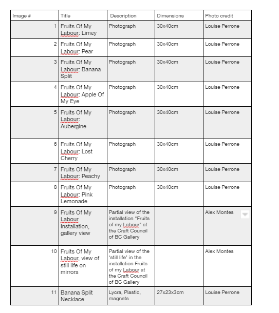
"The setting for the images shown here is my installation “Fruits Of My Labour” which was shown at the Craft Council of BC Gallery in Vancouver, Canada in the Fall of 2021. As a jeweller, my work is more likely to be displayed in the gift shop than the gallery; however, most visitors to galleries or museums will purchase a postcard, pencil, or pin rather than a painting. Fruits of My Labour explores the relationship between these spaces, the people who visit them, and the transactions that take place in them. The installation examines how jewellery is worn, displayed, photographed, and viewed, inviting visitors to consider what jewellery conceals and reveals about the maker, wearer, and themselves.
The framed portraits that line the gallery walls are reflected in the mirrored plinth at the centre of the space displaying an orderly still life of lycra-covered plastic fruit. The fruit has been sliced in half with a jeweller’s saw and hand-sewn into colourful fabric skins, hidden magnets allowing them to be worn on the body as jewellery. By setting the bisected fruit on mirrors, they become whole again, reflecting their missing halves, as well as the images on the wall that let the audience know they are made to be worn. Like the jewellery they are wearing, the model in the photographs is completely covered in lycra, and takes on poses reminiscent of Mannerist paintings - exaggerating and twisting the body, with a particular emphasis on elongated hand gestures. The lycra blurs and draws attention to everything it conceals, emphasizing curves and erasing markers of identity.
The decision to clothe my model in a full lycra bodysuit came long before the appearance of Kim Kardashian at the 2021 Met Gala sporting a black Balenciaga ensemble. Envisioning this work during a global pandemic, when we were still inventing ways to protect ourselves with homemade masks and disposable gloves, covering the model’s face and hands did not seem far from reality. Finding lycra bodysuits online is just a click away. Used in theatre, film, and television to create the illusion of invisibility, the suits have been adopted as fetish wear, and in the mid 2000s became popular costumes for sports fans and party-goers who realized the immediate visual impact of this simple monotone garment. I found that by erasing the model's identity and allowing their body and the background to conform to one uniform shade of grey, my jewellery lights up the photo, demands attention, and allows the viewer to engage with the image as they find it." Louise Perrone
www.louiseperrone.com
@louise.perrone instagram
Artist Talk: Louise Perrone | Fruits of My Labour Exhibition
review: fruits of my labour - Craft Council of British Columbia Craft Council of BC - review by Nathan Clark
message in a button: pin-back badges - Craft Council of British Columbia Blog post about Fruits Of My Labour written by Louise Perrone
meet Louise Perrone - Craft Council of British Columbia interview with Louise Perrone
-------------------
Artist Bio:
Louise Perrone is a Canadian textile jewellery artist whose work explores ideas about gender, labour, and sustainability. Employing techniques that combine the traditions of goldsmithing, hand sewing, and mending, she derives her materials from domestic and industrial textile and plastic waste.
Born in London, England, Louise Perrone holds a Bachelor of Art in Sculpture from the Nottingham Trent University and a Post Graduate Certificate in Art and Design Education from the University of Brighton. In 2002 Perrone graduated from Alberta College of Art and Design with a Bachelor of Fine Arts in Jewellery and Metals. Exhibiting widely across Canada, the USA and Europe, Perrone’s work has featured in several publications. She is a recipient of the Governor-General of Canada’s Academic Medal and the Alberta College of Art and Design Alumni Legacy Award. She teaches in the Jewellery Department at LaSalle College Vancouver.
SETTINGS & FINDINGS N.8 WITH camilla Luihn
SETTINGS & FINDINGS WITH CAMILLA LUIHN by matt lambert:
I first was in touch with Camilla Luihn to prepare for a visit to the Oslo National Academy of the Arts or KHIO to run a week long intensive with students. This intense time was an incubator for deep and rich conversations both with students and faculty. I admire Camillas dedication to exploring enamel, a process I know little about. She uses the specialized techniques of enameling and the format of the brooch to reflect on the detritus of a gathering. A way to memorialize the remnants of a joyous moment, a badge or keepsake reminding us that our emotional experiences come and go and the importance of remembering the good times when we did and hopefully will meet together again. -matt.
------
Det som blir igjen / What remains
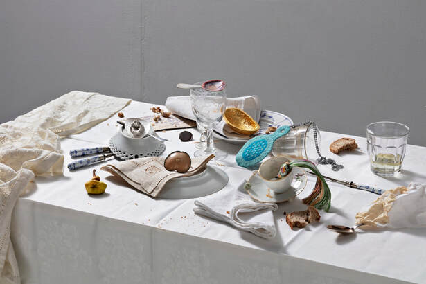
"Do you remember that party? That dinner? When we got up the next day and the floor was covered with debris. Curly napkins, wine stains, broken glass, and leftover food. As if a giant hand had swept it to the floor. As if someone had danced on the table. Before we cleared, it was like a polaroid image of a moment. A still life.
Maybe it was before the pandemic. Or was it after?
If I try to capture these moments; the party, everyday life, the encounters, smells and tastes - fleeting colors and shapes emerge. Abstract and intangible memories of what has happened. That cannot really be described, but now are melted into glass and metal.
And it’s what you see on the road. On the beach. Found in a pocket where it was long forgotten. It is the smooth stone, the shell, the pretty shard of glass. The concert ticket, the lock of hair. It’s the ring and the chain. Photos, receipts, keys. Through winter, spring, summer, and autumn. Do you also collect everything? I pick it up and take it with me. I look at it, take it with me or leave it.
But what do these objects mean? Do they function as a three-dimensional memory book for the society we live in? Without me, who puts them in context, they may be just worthless fragments to others. Symbols of love. Of time passing. Without us remembering what they are, where they come from - it might just be rubbish.
(Text from upcoming artist book)
I will argue that setting and finding is the anchor of this project that began as a fascination for the still life. It is based on inspiration from ancient Greek and Roman floor mosaics where food leftovers and rubbish are depicted in painstaking detail in the mosaic. These were called unswept floors (asàrotos òikos) and may have been a visual proof of abundance and wealth. Other interpretations may be that it was food for the dead, or memento mori. The collecting and examination of what might be considered rubbish engages me to reflect on what is valuable, how we interact, how we treat each other, our environment and our surroundings.
This project presents works that balance finely on the line of what is wearable and not wearable, what is the original and the copy, or what has been found or is created. Contemporary jewelry art opens up opportunities to explore bodily identity in a unique relationship with the public. Leftover food, moods, bills, lost friendships and unfinished projects draw up a narrative that is as poetic and personal as it is political.
I try to explore the potential for the dialogue and the communicative aspects of jewelry that relate to questions about identity, signals and cultural identity markers. My ambition as an artist is based on a strong desire to research and investigate visual, formal, and technical resources to express a comprehensible message. I am fascinated by jewelry as a mediation tool for communication and how it positions works of art into a context that is accessible to a larger audience. To me, the results of jewelry and objects being activated by the user appear as an eternal point of tension where the artwork intervenes and creates an interpersonal dialogue. The medium challenges art’s physical limit and immobility and achieve an ever-changing viewing arena.
My artistic research is centered around enamel as a technical medium and specialization. I find the process; the infinite technical and color possibilities so interesting and inspiring. I immerse myself into the enamel universe, only occasionally coming up for air. If you ask me why I find working with enamel so fascinating – I could talk for hours. But as with other technical processes it’s only a medium that allows me to express my artistic views. It’s not essential, but it is an important influence on my work." Camilla Luihn
Media handles:
www.luihn.no
www.luihn.no/portabel
http://instagram.com/luihn
http://instagram.com/portabelgalleri
www.khio.no
Picture Credits
List of photos
Photo: Camilla Luihn
- Installation view
- Installation view Kunstnerforbundet
- Fishbone. Enamel, copper, silver
- Flame. Enamel, copper, silver
- Braid. Enamel, copper, silver
- Bird head. Enamel, copper, silver
- Hand. Enamel, copper, silver
Photo: Camilla Luihn - Heart. Enamel, copper, silver
Photo: Camilla Luihn - Paper. Enamel, copper, silver
Photo: Camilla Luihn - Banana peel. Enamel, copper, silver
Photo: Camilla Luihn - Molded lemon. Enamel, copper, silver
Photo: Camilla Luihn
Photo: Camilla Luihn
SETTINGS & FINDINGS N.9 WITH Olaf Tønnesland Hodne
SETTINGS & FINDINGS WITH OLAF TØNNESLAND HODNE by matt lambert
The work of Oslo based artist Olaf Tønnesland Hodne directly questions the function of jewelry and its uses. The work made of stone at times is plausible to wear while other times monolithically manifests as a heavy burden requiring the imagination to think of what heavily reinforced garment would be needed to wear a 2kg brooch and where it should be located to not fatigue one's body through the day. The practicality in Olaf’s work is its clear questioning of function and use. Stone takes center and back stage confronting the viewer with shield-like forms while being maximally used to create the mechanisms that form the pin back.
"For me a setting is such an expressive way for us humans to hold on to, exhibit, and show our thoughts and feelings through material expression. As I work alot with alternative settings I find it tickles my brain when I turn up the size of the stone I'm setting, going from a small gem to two kilogram quartz. It gives me a moment of relief, that it isn't all about us humans, it's not our human size that is the standard of jewellery. I'll make brooches for trees and cows. they probably don't care, but ill make it for them.
In Findings, I think I use my collection of rocks, minerals and crystals to explore and understand what this universe is made out of. Working with stone really helps to ground me when I dissociate. These inorganic matters are lifeless. There is a serenity in them knowing they grow out of the laws of the universe, not from life or human hands, as so much of our objects and materials are around us. And if the stones have any power, it sure as hell is not for us and our romanticized worldview. They are too secretive.
I use stone as my main material and jewellery as my medium at the moment. I think the subject I'm in now is something I will continue for a while, as I don't feel finished with it yet. I try to lock some of my brooches and jewellery in a series or an exhibition, but I still continue after that with the concept.
I carve stone to the shape of a shield or a simplified one. I do this to put the colours and shapes of the stone in a visual language about identity and history as heraldry. Using this format to go back to pondering how the stone was made. Why, how and when did the endless soup of moving rocks end up like that? My focus lies in the geological processes that the stone has undergone and of which each individual rock type shows evidence. The minerals and crystals reveal a geological history of the stone's identity.
I am quite insistent in my expression of form with the shield and oblong shape. This has become a way of putting the minerals in the same position so that it is the character of the stone that comes out and is read. I therefore grind functional jewellery elements into the stone itself, only adding a brooch needle as extra material. This makes the stone functional without adding other materials and parts. Although the works become able jewellery, I often work with varying sizes so that it ranges from being a small pin on a shirt to a brooch weighing over 2 kg. The imaginary brooch now takes a bigger part in how one imagines the piece of jewellery on the body, due to its weight which makes it unusable as a physical piece of jewellery. Then again, does it lose its jewellery context because of size, weight and usability?"
Olaf Tønnesland Hodne
The work of Oslo based artist Olaf Tønnesland Hodne directly questions the function of jewelry and its uses. The work made of stone at times is plausible to wear while other times monolithically manifests as a heavy burden requiring the imagination to think of what heavily reinforced garment would be needed to wear a 2kg brooch and where it should be located to not fatigue one's body through the day. The practicality in Olaf’s work is its clear questioning of function and use. Stone takes center and back stage confronting the viewer with shield-like forms while being maximally used to create the mechanisms that form the pin back.
- ml
"For me a setting is such an expressive way for us humans to hold on to, exhibit, and show our thoughts and feelings through material expression. As I work alot with alternative settings I find it tickles my brain when I turn up the size of the stone I'm setting, going from a small gem to two kilogram quartz. It gives me a moment of relief, that it isn't all about us humans, it's not our human size that is the standard of jewellery. I'll make brooches for trees and cows. they probably don't care, but ill make it for them.
In Findings, I think I use my collection of rocks, minerals and crystals to explore and understand what this universe is made out of. Working with stone really helps to ground me when I dissociate. These inorganic matters are lifeless. There is a serenity in them knowing they grow out of the laws of the universe, not from life or human hands, as so much of our objects and materials are around us. And if the stones have any power, it sure as hell is not for us and our romanticized worldview. They are too secretive.
I use stone as my main material and jewellery as my medium at the moment. I think the subject I'm in now is something I will continue for a while, as I don't feel finished with it yet. I try to lock some of my brooches and jewellery in a series or an exhibition, but I still continue after that with the concept.
I carve stone to the shape of a shield or a simplified one. I do this to put the colours and shapes of the stone in a visual language about identity and history as heraldry. Using this format to go back to pondering how the stone was made. Why, how and when did the endless soup of moving rocks end up like that? My focus lies in the geological processes that the stone has undergone and of which each individual rock type shows evidence. The minerals and crystals reveal a geological history of the stone's identity.
I am quite insistent in my expression of form with the shield and oblong shape. This has become a way of putting the minerals in the same position so that it is the character of the stone that comes out and is read. I therefore grind functional jewellery elements into the stone itself, only adding a brooch needle as extra material. This makes the stone functional without adding other materials and parts. Although the works become able jewellery, I often work with varying sizes so that it ranges from being a small pin on a shirt to a brooch weighing over 2 kg. The imaginary brooch now takes a bigger part in how one imagines the piece of jewellery on the body, due to its weight which makes it unusable as a physical piece of jewellery. Then again, does it lose its jewellery context because of size, weight and usability?"
Olaf Tønnesland Hodne
Pictures List & Credits
Picture list:
- Graphic Granite Shield, backside view, 2021, Grapic granite, brass, steel
Photo: by artist - Amethyst Window, 2020, synthetic amethyst, copper, steel
Photo: by artist - Nephrite Shield, 2019, nephrite, silver, steel
Photo: by artist - Obsidian Shield, 2019, Obsidian, silver, steel
Photo: by artist - Labradorite Shield, 2019, labradorite, steel
Photo: by artist - Huge Quartz Window, 2021, Synthetic quartz, brass, steel
Photo: by artist - Tigers Eye Shield on Chrysocolla podium, 2021, tigers eye, brass, steel, chrysocolla
Photo: by artist - Sapphire Window on Rose Quartz Podium, 2021, Synthetic sapphire, silver, steel, rose quartz
Photo: by artist - Installation view for Colours in the dark, part 2, at Kunstbanken i Hedmark, Hamar
Photo: Øystein Thorvaldsen - Installation view for Colours in the dark, part 2, at Kunstbanken i Hedmark, Hamar
Photo: Øystein Thorvaldsen - Installation view for Colours in the dark, part 2, at Kunstbanken i Hedmark, Hamar
Photo: Øystein Thorvaldsen - Installation view for Colours in the dark, part 2, at Kunstbanken i Hedmark, Hamar
Photo: Øystein Thorvaldsen - Installation view for Colours in the dark, part 1, at Format, Oslo, 2021
Photo: Thomas Tveter - Installation view for Colours in the dark, part 1, at Format, Oslo, 2021
Photo: Thomas Tveter - Installation view for Colours in the dark, part 1, at Format, Oslo, 2021
Photo: Thomas Tveter - Installation view for Colours in the dark, part 1, at Format, Oslo, 2021
Photo: Thomas Tveter - Installation view for Colours in the dark, part 1, at Format, Oslo, 2021
Photo: Thomas Tveter - Installation view for Colours in the dark, part 1, at Format, Oslo, 2021
Photo: Thomas Tveter - Portrait
Photo: Kristoffer Kråkstad
